You can use the CheckBox control to represent a Boolean value in a report. By default, the CheckBox control appears as a small box inside an empty Checkbox. If the Checked value is set to True, the small box appears with a check mark; if False, the box is empty. By default, the checkbox is empty.
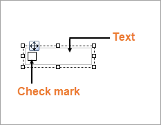
Clicking the four-way arrow selects the control and reveals its properties in the Properties panel.
| Property | Description |
|---|---|
| Checked | Gets or sets a value indicating whether the check box is in the checked state. You can also set the Checked property of the CheckBox in code or bind it to a Boolean database value. |
| Text | Gets or sets the printed caption of the CheckBox . |
| CheckAlignment | Gets or sets the alignment of the CheckBox text within the control drawing area. |
You can double-click the CheckBox control to enter edit mode and enter text directly in the control, or you can enter text in the Properties panel or you can assign data to display in code through the Text property.
In edit mode, you can modify the CheckBox properties in the Property Grid. Formats apply to all of the text in the control.
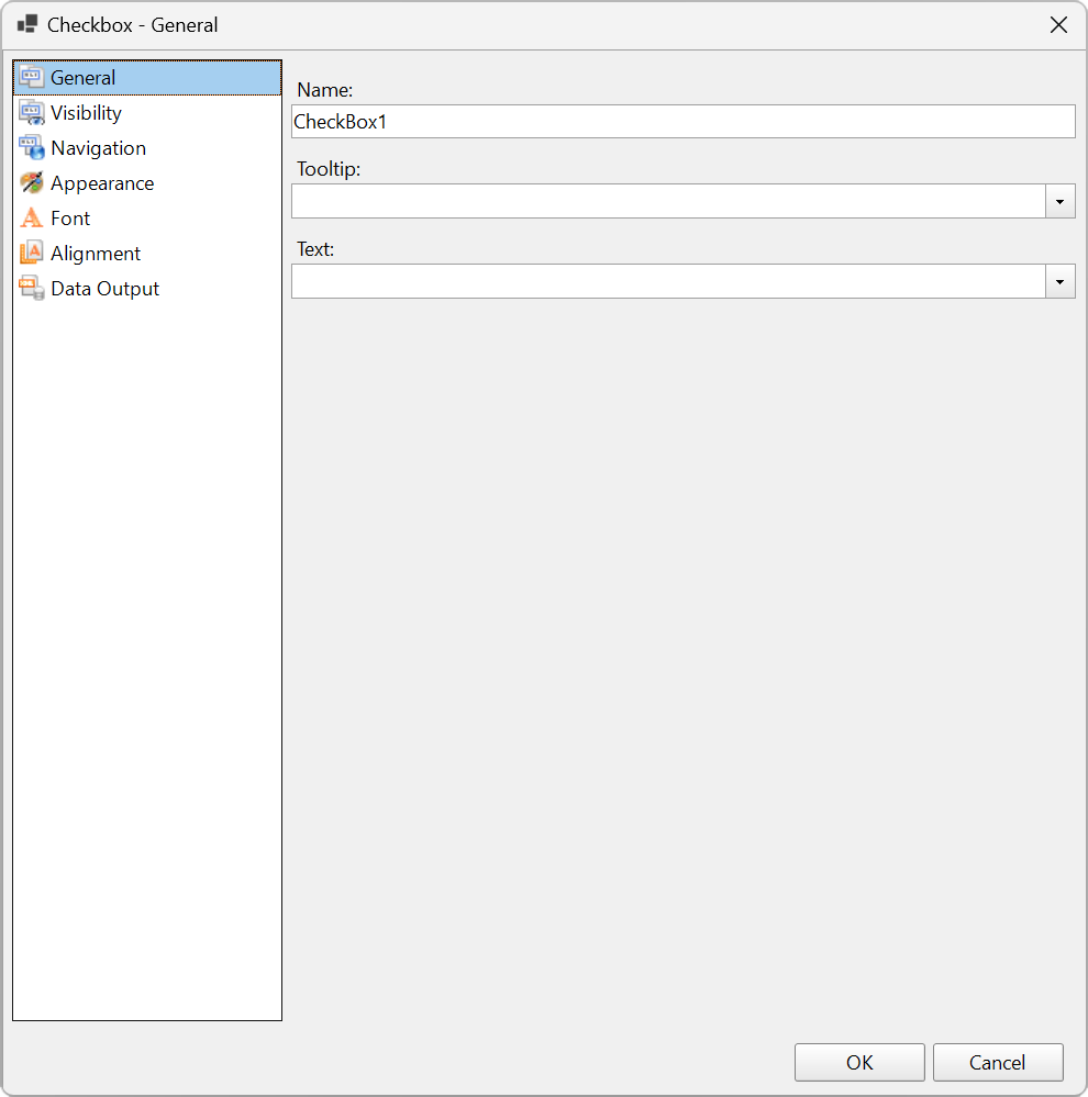
You can set the CheckBox properties in the CheckBox dialog. To open it, with the CheckBox selected on the report, under the Properties panel, click the Property dialog link.
Click on a property section name below for more details on the properties it contains.
 GeneralGeneral
 Name: Enter a name for the Checkbox that is unique within the report. This name is displayed in the Document Outline and in XML exports. You can only use underscore (_) as a special character in the Name field. Other special characters such as period (.), space ( ), forward slash (/), backslash (\), exclamation (!), and hyphen (-) are not supported.
Tooltip: A textual label for the report item used to include TITLE or ALT attributes in HTML reports.
Text : Enter an expression or a static label, or choose a field expression from the drop-down list. You can access the expression editor by selecting <Expression...> in the list. The value of this expression or text is displayed in the report to the right of the checkbox.
 VisibilityVisibility
Initial visibilityallows you to select from the following options:
Visibility can be toggled by another report item: Select this checkbox to specify a report control to use as a toggle to show or hide the checkbox. Then specify the TextBox control to display with a toggle image button. When the user clicks the TextBox control, the Checkbox changes between visible and hidden.
 NavigationNavigation
Select one of the following actions to perform when a user clicks on the Checkbox.
None: The default behavior is to do nothing when a user clicks the Checkbox at run time.
Jump to report: For drill-through reporting, select this option and provide the name of a local report, the relative path of a report in another folder, or the full path of a report on another server. You can also use expressions to create drill-through links.
Parameters: Enter the Name and Value of each parameter you want to pass to the targeted report. You can also Omit the parameter by setting the value to True. The parameter names you supply must be the same in both reports.
Jump to bookmark: Select this option and provide a valid Bookmark ID to allow the user to jump to the report control with that Bookmark ID.
Jump to URL: Select this option and provide a valid URL to create a hyperlink to a Web page.
Apply Parameters: Select the Name, the Type, and the Value of the parameter to set a parameter value through user action. See Actionable Parameters for more information.
 AppearanceAppearance
Border Style: Select a style for the border.
Width: Enter a value in points to set the width of the border.
Color: Select a color to use for the border, or select the <Expression...> option to open the Expression Editor and create an expression that evaluates to a .NET color.
Background Color: Select a color to use for the background of the Checkbox.
Image: Enter an image to use for the background of the Checkbox.
Image Source: Select whether the image comes from a source that is External, Embedded, or Database, or select the <Expression...> option to open the Expression Editor.
MIME Type: Select the MIME type of the chosen image.
Background repeat: Specify how the background image fills the space of the CheckBox.
 FontFont
Family: Select a font family name or a theme font.
Size: Choose the size in points for the font or use a theme.
Style: Choose Normal or Italic or select a theme.
Weight: Choose an enumerated weight value or select a theme.
Color: Choose a color to use for the text.
Decoration: Choose from None, Underline, Overline, or LineThrough.
 AlignmentAlignment
Amount of space to leave around report control
Top padding: Set the top padding in points.
Left padding: Set the left padding in points.
Right padding: Set the right padding in points.
Bottom padding: Set the bottom padding in points.
 Data OutputData Output
Element Name: Enter a name to be used in the XML output for this Checkbox.
Output: Choose Auto, Yes, or No to decide whether to include this Checkbox in the XML output. Auto exports the contents of the Checkbox only when the value is not a constant.
Render as: Choose Auto, Element, or Attribute to decide whether to render text boxes as Attributes or Elements in the exported XML file. Auto uses the report's setting for this property.
Attribute example: <table1 Checkbox3="Report created on: 7/26/2021 1:13:00 PM">
Element example: <table1> <Checkbox3>Report created on: 7/26/2021 1:13:28 PM</Checkbox3>
In the edit mode, you can use the following keyboard shortcuts.
| Key Combination | Action |
|---|---|
| Enter | New line. |
| Alt + Enter | Saves modifications and exits edit mode. |
| Esc | Cancels modifications and exits edit mode. |